PWHL: Vancouver Goldeneyes Branding
Services:
Logo Design
Branding
Print Production
Digital Design
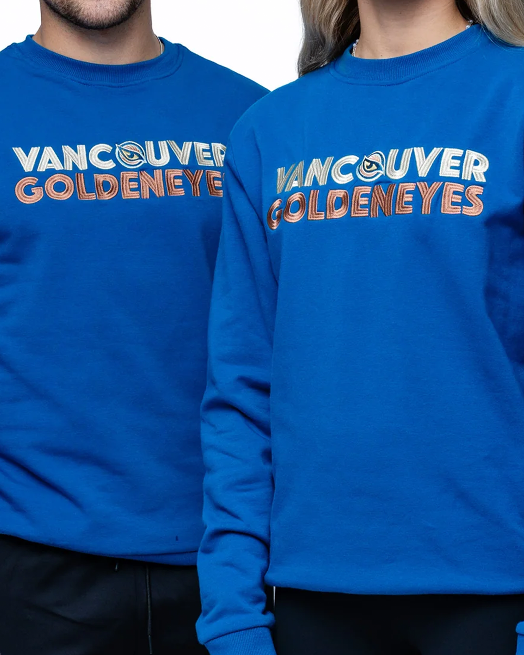
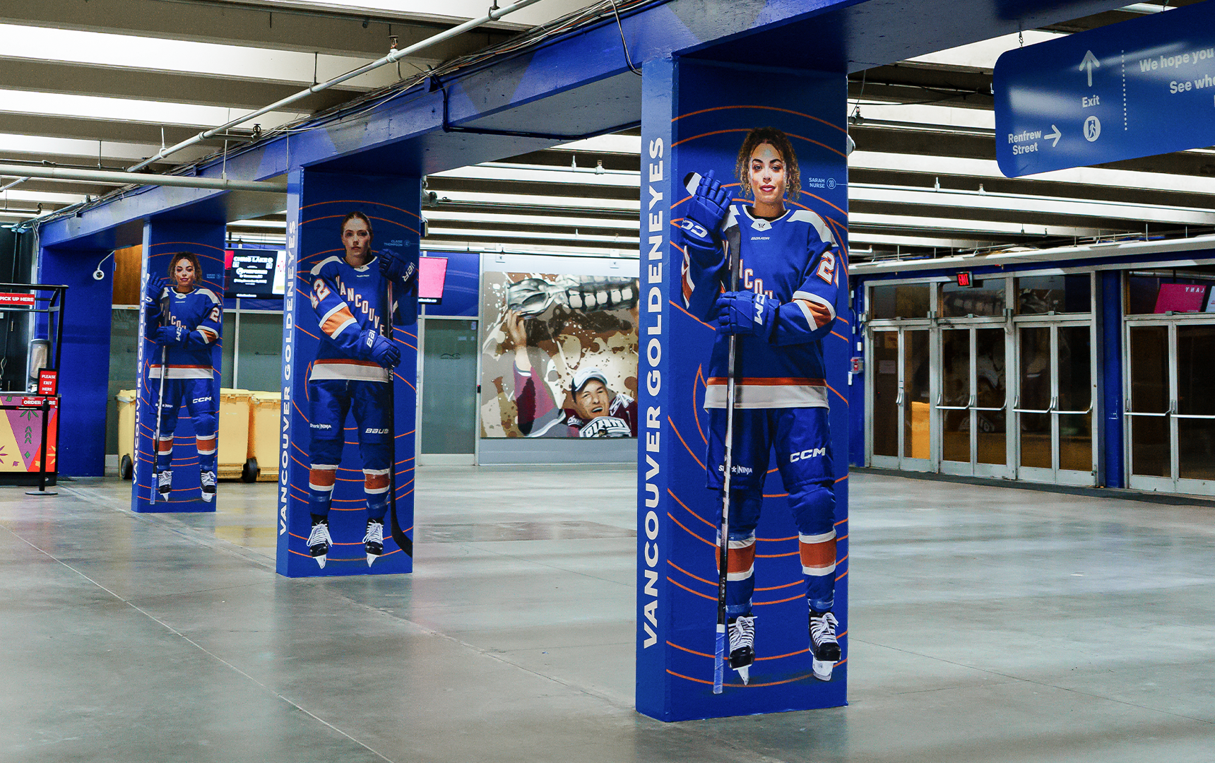
The Professional Women’s Hockey League (PWHL) announced its expansion to Vancouver, British Columbia with the introduction of its newest team, the Vancouver Goldeneyes. Set to begin play in the 2025–26 season, the objective was to create a bold, high-impact brand identity that would energize fans, honour the city, and establish a strong presence both locally and across the league.
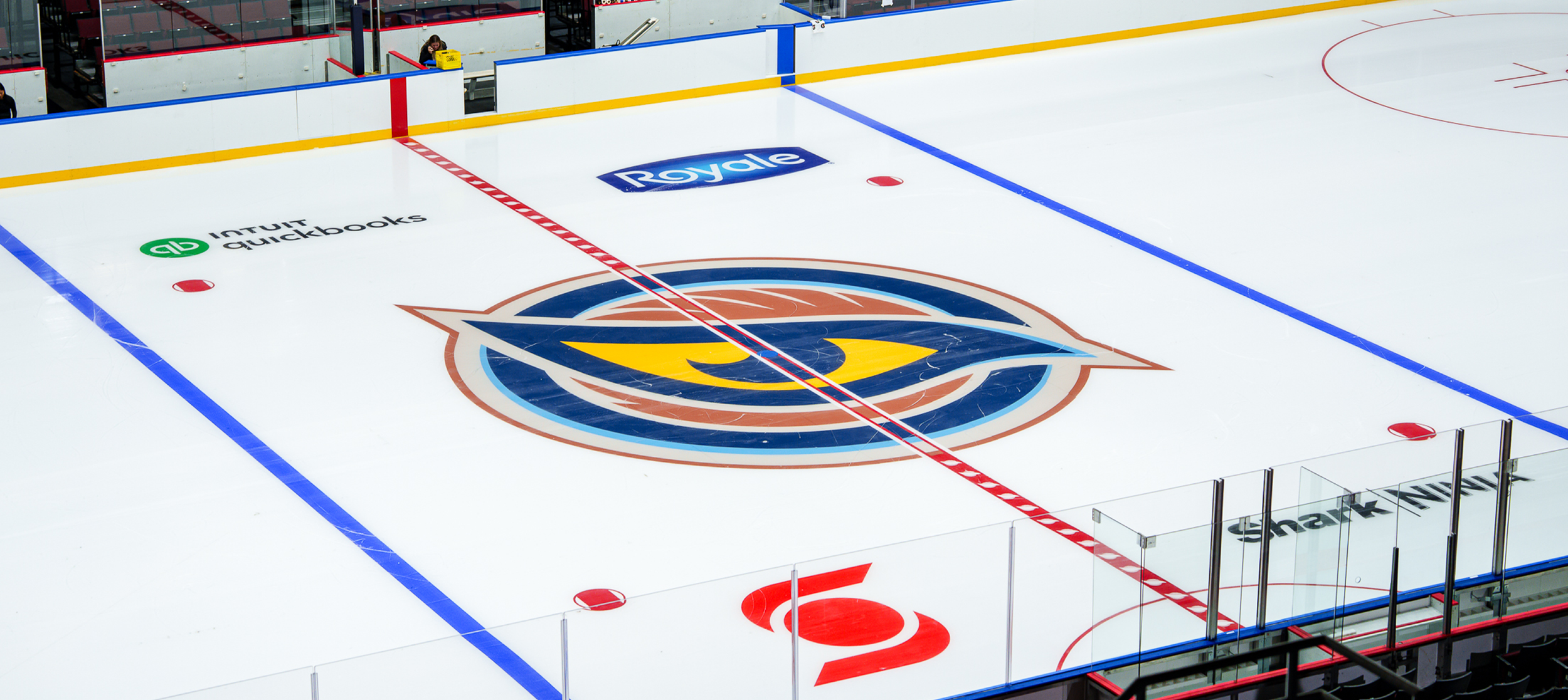
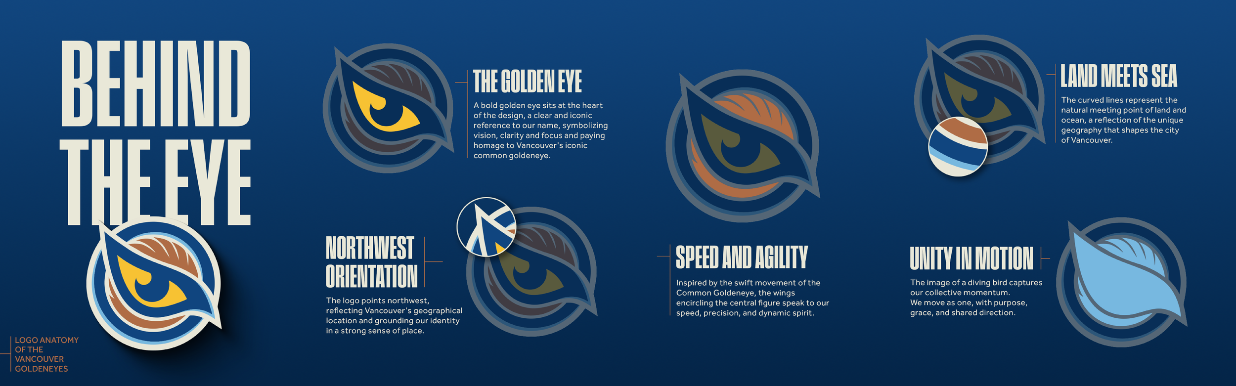
The name Goldeneyes is inspired by the Common Goldeneye, a striking bird native to British Columbia’s coastal waters and forested lakes. Recognized for its piercing yellow eyes and lightning-fast reflexes, the goldeneye is a creature of precision, agility, and resilience - qualities that mirror the speed and intensity of hockey, as well as the athletes who play it. These attributes informed the visual identity, expressed through striking colours, strong typography, and bold graphic elements.
Beyond representing the team and the sport, the brand reflects the region it belongs to. Research into Vancouver’s natural landscape and cultural nuances guided the design decisions. Natural forms, sharp contrasts, and purposeful detailing work together to capture the energy of the city and the environment so many call home.
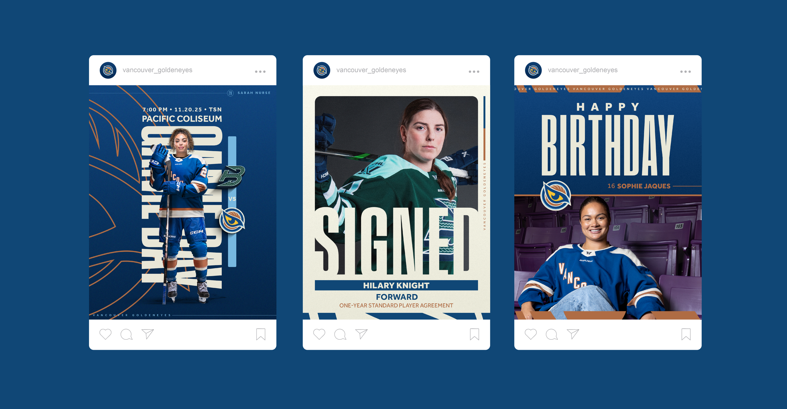
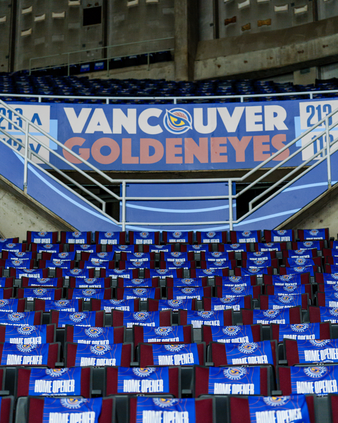
The identity needed to feel aggressive, modern, and timeless, while remaining flexible across both print and digital applications. The brand identity was built to scale seamlessly across a wide range of touch points, including merchandise and fan apparel, arena graphics and signage, social media and web assets, and future team jerseys—ensuring a cohesive and impactful brand presence.